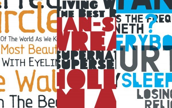
In the past, R.E.M. have had countless unique logos and typography. From Ed Rogers’ handwriting on Out Of Time to the many hand-drawn song titles of Reckoning, typography has been an important part of R.E.M.’s artwork. Until recently, individual letterforms were made as needed, but for the last five years, Michael Stipe and Chris Bilheimer have been creating entire alphabets and turning them into fonts to use for the band’s artwork.
Joining forces with the type foundry TypeTrust and its Athens-based co-owner Neil Summerour, we have turned these fonts into digital files available for download. We are proud to offer these three typefaces for sale:
ACCELERATE: This font was created for the album Accelerate and used on many projects such singles, tour advertising, merchsndise, and the supernatural superserious.com website.
TOURFONT: Tourfont was created in 2003 for In Time: The Best of R.E.M. packaging and the 2003 tour.
ORANGE: Based on a stencil made of orange plastic, this typeface was made for the album Around The Sun and used frequently on tour merchandise.
Thanks to Neil, these fonts are available in the TrueType and OpenType PS format and compatible with Mac and PC. Please visit the TypeTrust site to check them out.